
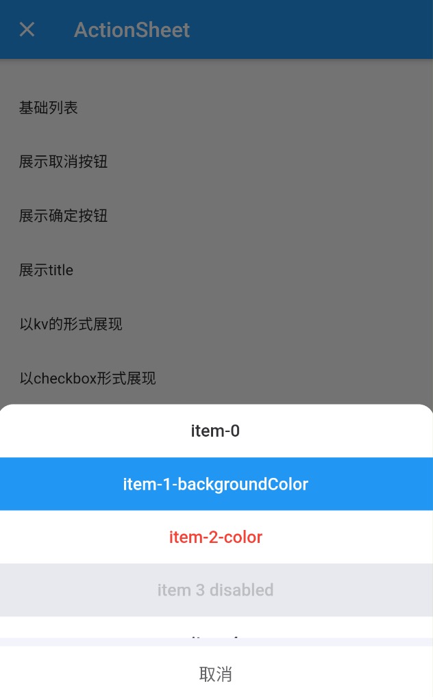
# ActionSheet 动作面板
# 基础用法
List list = [
	{
    'label': 'item 1',
    'value': 1,
  },
  {
    'label': 'item 2',
    'value': 2,
  },
  {
    'label': 'item 3',
    'value': 3,
  },
];
...
MillActionSheet.open(
  context,
  list: list,
  height: 220,
  labelAlias: 'label',
  onSelect: (val) {
    print(val);
  },
);
# 取消按钮
showCancel 展示取消按钮,cancelText 设置取消按钮的文案,onCancel 取消回调函数。
MillActionSheet.open(
  context,
  list: list,
  height: 220,
  showCancel: true,
  labelAlias: 'label',
  cancelText: 'CANCEL',
  onCancel: () {},
  onSelect: (val) {
    print(val);
  },
);
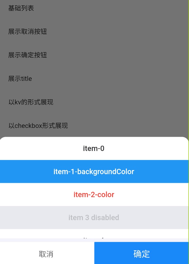
# 确认按钮
showConfirm 确认按钮展示,confirmText 确认按钮文案,confirmTextStyle 确认按钮的样式。
MillActionSheet.open(
  context,
  list: list,
  height: 220,
  showConfirm: true,
  confirmText: 'OK',
  confirmTextStyle: TextStyle(
    fontSize: 18,
    color: Color(0xffffffff),
  ),
  labelAlias: 'label',
  onSelect: (val) {
    print(val);
  },
);
# 设置 title
title 字段设置 title。
MillActionSheet.open(
  context,
  list: list,
  height: 220,
  showCancel: true,
  title: 'this is title',
  labelAlias: 'label',
  onSelect: (val) {
    print(val);
  },
);

# 自定义内容
child 可以设置自定义的元素。
MillActionSheet.open(
  context,
  child: Container(
    height: 300,
    child: Text('自定义'),
  ),
  onSelect: (val) {
    print(val);
  },
);
# key:value 模式
数据以 k:v 的模式自动展示。listType 设置为 ‘kv’。
MillActionSheet.open(
  context,
  list: list,
  listType: 'kv',
  labelAlias: 'label',
  height: 220,
  onSelect: (val) {
    print(val);
  },
);
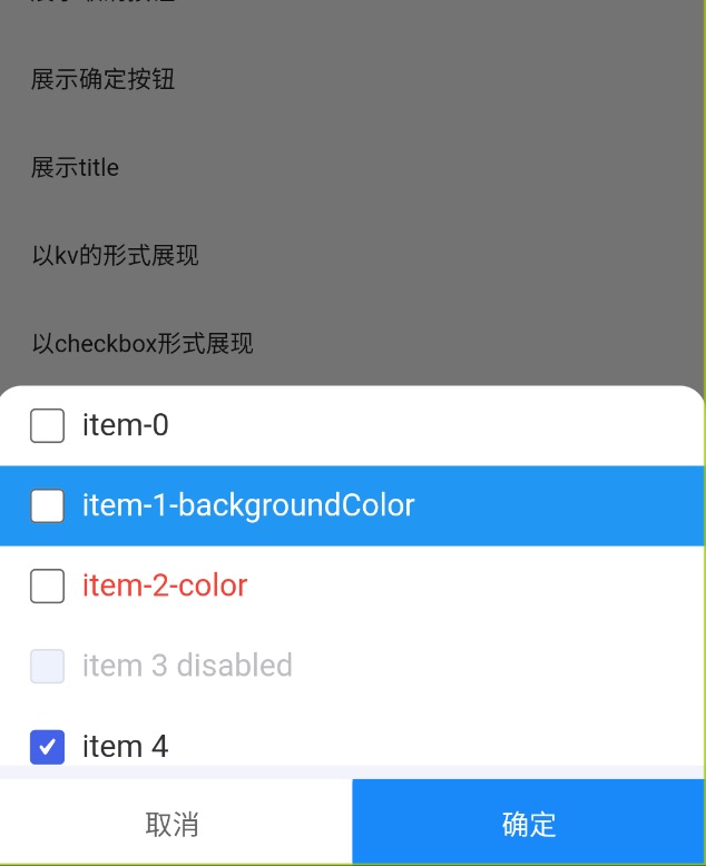
# checkbox 模式
数据以 checkbox 模式展示。listType 设置为 checkbox。defaultChecked 为默认选项。onConfirm 会返回已选择的值。
MillActionSheet.open(
  context,
  showConfirm: true,
  list: list,
  listType: 'checkbox',
  labelAlias: 'label',
  height: 220,
  defaultChecked: [4, 5],
  onConfirm: (result) {
    print(result);
  },
);
# Attributes
| 字段名称 | 说明 | 类型 | 默认值 |
|---|---|---|---|
| context | |||
| scaffoldState | |||
| showCancel | 是否展示取消按钮 | bool | false |
| showConfirm | 是否展示确认按钮 | bool | false |
| title | 标题 | String | |
| radius | 设置顶部圆角 | double | 15 |
| height | 面板高度 | double | |
| labelAlias | label别名 | String | name |
| valueAlias | value 字段的别名 | string | value |
| list | 需要展示的列表 | List | [] |
| child | 自定义的元素,当设置此项后,list 失效。 | Widget | |
| listType | 类型(没设置child生效) | value/kv/checkbox | value |
| onSelect | value 模式下选择回调 | ||
| onConfirm | 点击确认按钮回调 | ||
| onCancel | 点击取消按钮回调 | ||
| confirmText | 确认按钮文字 | 确认 | |
| cancelText | 取消按钮文字 | 取消 | |
| backgroundColor | 背景色 | Color(0xffffffff) | |
| confirmBgColor | 确认按钮背景色 | Color(0xff1989fa) | |
| defaultChecked | 设置为checkbox时,默认选项。 | ||
| textStyle | 文字样式 | ||
| cancelTextStyle | 取消按钮文字样式 | ||
| confirmTextStyle | 确认按钮文字样式 | ||
| titleTextStyle | 标题文字样式 |
← Dialog 对话框 Notice 通知 →